Podcast: Play in new window | Download (46.1MB)
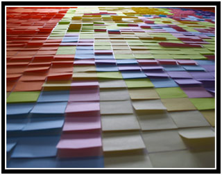 Back in September, I ran across a website that had a tutorial for making Post-it note mosaics. I didn’t even read it, just skimmed it long enough to realize that they used Photoshop for their pre-process trickery. I knew I could do what they had done; I wanted to do what they had done. But where? And more importantly, why? National Boss Day! I work in a lively office and I knew that something like this would go over well. I looked up National Boss Day (a Hallmark holiday if ever there was one) on the internet and discovered that it wasn’t until October 16th (ironically, a Sunday). I placed a little squiggly mark on my calendar; something to remind me. The week before the 16th rolled around, I called a coworker to see if they’d be interested in spending Sunday night arranging thousands of Post-its on a wall in our boss’s office. I asked him because he had a key. Although he thought the idea was great, he mentioned a small problem: On Saturday night, both he and the boss were getting on a plane bound for Orlando. They’d be spending the entire week at the EDUCAUSE conference. What to do, what to do. Why, take advantage of the boss’s absence and bring the whole department into it, of course! That week, I set myself to work. There was much to do. First, I selected a picture off of his university webpage. It was a nice, formal photo that, incidentally, I had taken myself a year before. It had strong lines that I hoped would keep him recognizable at exceedingly low resolutions. The background was a complex tangle of evergreen trees, but I could fix that.

With the photo perspective known, I set about measuring the walls in his office. What with the picture frames, windows, and whiteboard in there, not one of the four walls were a perfect fit for the project. I looked for other walls in the main entry area and our receptionist offered the wall behind her desk. At 77″ x 110″, it was the biggest “canvas” we could find. I thought that with the measurements in hand, the math would be rather simple, but it got sticky (pun intended!) quickly. I wanted to use the big Post-its because it would mean we could cover the wall with less work. Unfortunately, at 3″ x 3″, the effective “resolution” of our mosaic would only be 25×36. I did a test reduction of the image in Photoshop and quickly realized that the 3″ x 3″ Post-its would reduce our director to anonymity. Without the option of moving to a larger wall, I was forced to move to smaller sticky notes. “Regular” Post-its are 2″ x 1.5″, decidedly rectangular. Would it be possible to render his image without the use of squares? More testing in Photoshop was required. First, I redid the calculations and came up with a slightly more hopeful resolution of 38×73 pixels. I evaluated the image again after its reduction and decided that anyone who knew the boss would recognize him in the mosaic… barely. The next step was to figure out how to adjust for the decidedly non-squareness of my Post-it “pixels.” 2″ x 1.5″ is a 1.3333 ratio, so I resized my original image to stretch its height to make it 133% taller. This made the boss look tall and skinny with Photoshop’s square pixels, but I hoped that when we stacked up all those 1.5″ Post-its together, they’d squish him back down to normal proportions. Conceptually, I was pretty confident it would work, but I had this nagging feeling that, once up on the wall, it might turn out a little funny.

At this point I also realized that it take almost 3000 Post-its to cover the wall! Before I ran out and bought all those sticky notes, I had to decide how many colors I wanted. Post-its are surprisingly expensive and since the project cost was coming out of my pocket, I didn’t want to buy more than was absolutely necessary. Using my tiny, 38×73 image in Photoshop, I experimented with the “Save for web…” function (using the .gif settings) and eventually settled on 7 colors. In the process, I significantly improved the results by erasing the pine tree background as well as changing the color of his red tie to green (in order to separate it from the few colors used in his skin tones.) At the office supply store, I’m sure the woman behind the counter wondered why I spent 15 minutes closely examining their Post-it section. After much deliberation, I carried 3 multi-packs up to the register, each with 1200 Post-its in various colors. Exactly seven colors, actually. The total was just over $30.
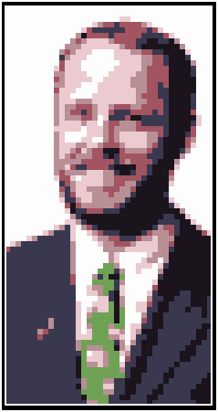
Back at work, I noticed that the packaging indicated that each post it was 1 7/8″ x 1 3/8″ in size. I thought it was 2″ x 1.5″! Had I based my measurements on a different brand of sticky note? I re-measured the new batch of Post-its and discovered that they were, as I’d hoped, 2″ x 1.5″. An eighth of an inch in both directions seems to me to be quite the oversight in this day of machine-precision manufacturing, but whatever. I didn’t need to resort to math again. I used my scanner to get a sample of each color of newly-purchased Post-it. Back in Photoshop, I used the wand tool to select each color, one by one, and replace it with one of the colors I had bought. It took a bit of experimentation to get the best fit – all the colors, while strikingly different in hue, were essentially the same luminosity. The subtleties of shading with pastel colors was more difficult than I expected. I had planned to take advantage of a projector to simply project the image, straight from Photoshop, onto the wall. It would then be a matter of “post-by-color.” Unfortunately, the stretchy version was no longer in the same aspect ratio as our wall, so I decided to just print the image out on tabloid paper and use that as our reference image.

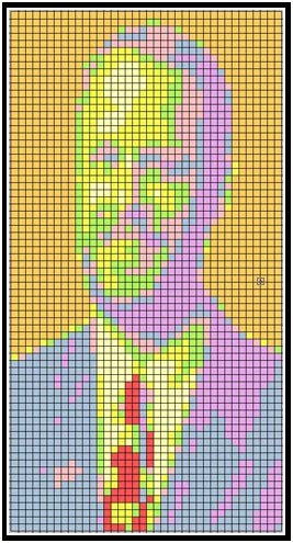
To separate out the individual pixels a little better, I pulled in guides lines at every single intersection. 38 times horizontally, 73 times vertically. In retrospect, I think I could have adjusted the grid to work the same way, and much more quickly. Thursday afternoon, I loaded up all the materials and headed down to the computer center. Included with all the little pads of paper and my reference image were my digital camcorder and laptop – I planned to time-lapse the event.
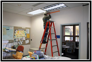
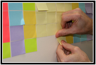
For the next four hours, sticking Post-its to the wall was my only concern. At least I had help! All told, five staff members and two student assistants worked together to create the Post-it mosaic, with many more stopping throughout the afternoon to offer moral support.
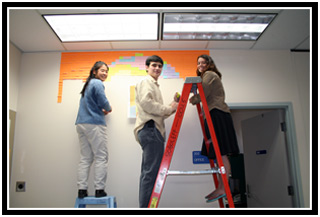
We discovered many things along the way. Post-it notes come in different sizes. You wouldn’t think one-third of a millimeter is a big deal, until you place 38 notes side-by-side. That makes the row almost 13 millimeters short. That’s about half an inch; one-third the length of a Post-it! With four people working at once on different columns, we quickly realized that gaps or overlaps occurred all too regularly. We needed a different system.

The one we hit on that seemed to work the fastest was to lay out only one row at a time. At least then we never strayed far from being horizontally level on any given line. Also, since we were working from a reference page, it was easiest to have two people placing the notes and one person reading off the colors. Much of the afternoon sounded something like this: “Starting from the left; 13 orange, 2 blues, 3 neons.” “On the right; 7 orange, 13 blues, 2 purple.” “Left; 3 blue, 2 purple, 2 green.” “Right; 2 green, 7 purple.” “Left; 2 blues, 2 yellow.” “Right; 3 greens, and that’s it.” “Next line, on the right…” It sounds more tedious than it actually was; we were cruising near the end and finding more than enough time between instructions to chat about other things.
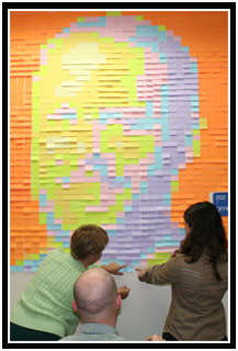
Near the end, as the project was really starting to take shape, we noticed that many of the Post-its had their lower edges curling away from the wall. The harsh lighting from above created some pretty severe shadows that only helped to break the image up, making it harder to discern who the mosaic was supposed to represent. We decided to turn off the fluorescents, letting the ambient light illuminate our work of art. The change was immediate and drastic. Without the light shining down from above, the Post-its appeared nothing more than the colored pixels they were supposed to represent. Anyone that worked in the ITS department would easily recognize their director’s 8-foot face! Just three of us stayed to finish up after the work. In the end, my math served me well. The left side of the mosaic was slightly lower than the right, by perhaps an inch, but it was just enough that we couldn’t quite fit in the last row of Post-its. It didn’t matter, though; nobody would ever be able to tell. We stepped back and evaluated our creation.
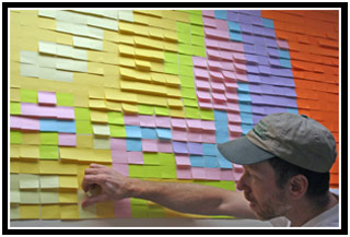
All three of us decided it could use a bit of improvement. We broke up the solid vertical line of green Post-its on the left-hand side of his face, and filled in his tie with more red notes. In an effort to ensure that the Post-its would remain attached throughout the night (and weekend; the boss wasn’t due back until Monday!), I used a book to smooth them down. This had the added benefit of reducing at least some of the curl on the notes that stuck out. Before stopping the time-lapse, my coworkers and I quickly calculated the number of Post-its we used, remembering, at the last minute, to compensate for the office sign. 2872. I scrawled the number on a piece of paper and held it up in front of the camcorder. We were done.
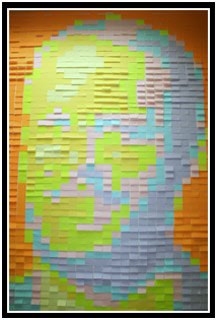
I expected I’d dream of Post-its all night long, but – thankfully! – that didn’t happen.
The next morning, I came in to check on the mosaic. A single Post-it rested on the floor; it would hold. The only thing to worry about now was whether the boss would happen to stop by the office on the weekend. We got assurances from his significant other that that would not happen. The night after we put up the mosaic, I showed the time-lapse to my wife. I happened to be listening to a song by Jonathan Coulton at the time, and the music, if not the lyrics, seemed a perfect match for the on-screen action. The video was slightly over ten minutes long, though, and the song only four. It would need a bit of editing before anyone else could see it. I started work immediately. The next day, I showed the resulting music video around the office. It went over well; everyone thought it quite amusing. I had a feeling that the digital file would be passed all over campus, and I worried that someone might run into the boss over the weekend and ruin the surprise. I quickly added a title to the beginning that would, hopefully, keep the secret safe. Early Monday morning, most of the office met the boss for breakfast before work at the Southeast Waffle Company. I left about 15 minutes before early so that I could make one last inspection of the mosaic… and to set up an inconspicuous video camera to capture his reaction. Our receptionist came in at the same time and, with the lights turned out for the full effect, cleared the counter of everything but six votive candles.
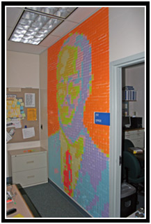
We waited by the windows until he drove up and then everyone ducked out of site. The candles drew his eye as he walked through the door and I barely hear him remark, “Isn’t that nice…” A moment later he looked up to see the mosaic and… …well, you can see that for yourself. My time-lapse, complete with the boss’s initial reaction, is below:
At the risk of coming across as a complete Coulton fanboi (after all, I paired another song of his to one of my videos in a previous entry), I’ll trackback to his blog entry about the song, I used, “I Feel Fantastic.” He really does make good music.

Simply amazing..can i tell people i know you???
Nice job…time lapse is cool too….
you never cease to amaze me.
very nice. i’m surprised anyone would be so intentionally massochistic as to a> use *smaller* post-its and b> use the *non square* ones. yeesh.
very nice result, and i love the time-lapse. i thought of documenting the process of building my first one, but i wasn’t even sure i would finish in a day. plus, i didn’t think of the time-lapse potential until i was halfway done…
[…] arlo midgett took the post-it mosaic and ran with it: and documented his creation with time-lapse photography and images of most of the prep. […]
Charles, if that was you that created the first (Elvis) Post-it mosaic on LifeHacker.com, you have my thanks! It was my inspiration and credit should be given where it’s due.
As for intentionally using the small Post-its, well, it certainly wasn’t my first choice. You do what you can with the wall ya got.
The time-lapse was worth it, but you brought up something else I forgot to mention: Having that camera setup was what kept us from taking a break and finishing the mosaic the following day. We just HAD to get the entire process in one take!
UNBELIEVABLE….I’M SO GLAD I LET YOU PLAY ALL THOSE COMPUTER GAMES WHEN YOU WERE LITTLE . VERY IMPRESSIVE ARLO
I can’t download the time-lapse videos. I get en error when I click on the link. Are they still available? I’d live to see them. Congratulations on a job well done.
[…] Four months after we created the Post-It Note mosaic of our boss at work, we decided to take it down. Ever since I published the accompanying time-lapse video, ideas have been batted around on how to memorialize its removal. When the big day came a few weeks ago, we didn’t record another time-lapse video… though you wouldn’t know it, looking at the final video. […]
[…] I thought this was a cool idea so I decided to do some more investigating and it turns out that the internet is awash with Post-It artists. Though one comment on the Post-It note art trend struck me as somewhat cruel but probably correct. On MetaFilter BoringPostcards wrote “Further evidence for my theory that the internet was BUILT by people with too much damn time on their hands.” Some were inspired by the Elvis mosaic, like this one, put up for National Boss Day. Be sure to check out the time lapse photography of the installation. […]
[…] It only took a few days for the painting to dry, but we didn’t hang it up until months later. I always felt a bit guilty about that; it was the longevity of my Post-It Note idea that monopolized the wall space… […]
I’m desparatly trying to come up with a pattern to do this when my bosses go out of town and I can’t figure it out! Can anyone make the grids for me????? HELP?
Hi, Lisa.
I could probably make the grids for you without it being too much trouble. Did you read my full blog entry? There’s a lot of information we’d need to figure out, the most important being:
1) Wall size, length and width,
2) Which size of Post-Its you want buy, length and width, and
3) Number of colors you have to deal with.
If you send me a photo (and assuming it’s a decent one that will work well), I think I could get the grid back to you in a day or two.
My only requirement is that you come back and tell us how it went!
I love it! I too am trying to do a post it mosaic. A friend and I are supposed to do it this weekend but we are having a hard time with photoshop. We’ve been following the instructions on Mental Hygiene’s website but we are having a really hard time getting the grid lines on. Have any ideas?
BJ,
Okay, here’s the cheat I used; you’ll probably have to play around with the setting for it to work for you.
Once you’ve got your image pefectly reduced to a 1-pixel to 1-post-it ratio, you can go into Photoshop’s View settings and turn on the grid. (The grid is simply a visual overlay, a guide, for your image.) When you set it up at first, the grid probably won’t be perfectly aligned with your pixel/post-its. Go into Edit -> Preferences and fiddle with the settings. I changed the grid color to black and had the grid lines only 1 pixel apart; remember, I was working with a tiny 38×73 image. Once the grid lines were in place and evenly dividing my picture up into 1-pixel segments, I zoomed in until the picture covered the entire screen.
Now, here’s the trick:
Use the Print Screen key to capture the screen and copy it to memory. Create a new, blank Photoshop document, and paste the resulting screen capture into it. Crop out all the excess and, voila! you should have a nice, large image you can print out and use as your reference sheet!
The webapp, Heavy Mural, probably could have helped, although it doesn’t allow for the use of non-square sticky notes.
Wow, that Heavy Mural thing is pretty darn cool. Personally, I enjoyed working out the process with math and with Photoshop, but for those looking for help in the future, I’ll definitely send them there.