Tag Archives: infographic
April 4, 2012

PV Infographic 3: Transportation

I usually put a picture up at the top of every blog post, but I think I’ll place this one down below the text.  I’m sure you’ll understand why when you see our next infographic.

This one’s all about transportation.  Specifically, the time we spent traveling from place to place on our trip.

It was easy enough for me to collect this data.  I spent a lot of time on my iPhone on those long bus rides.  Watching movies, reading books, and listening to podcasts; it really wasn’t such a bad time.  At some point during the long ride, I’d remember to jot down the beginning and end points in the Notes app and, once the trip was done, I’d count up the hours we’d spent on the road and jot that down, too (rounding to the nearest quarter hour.)  While I did the same for trains, boats, and minivans, I neglected to write down much of anything about our airline travel.  I had to recreate that data by digging through archived emails for the itineraries.

For obvious reasons, I didn’t keep track of any travel within the cities and towns we visited.  Taxis, metros, city buses and the like were too frequent and too short to worry over.  To that end, what you see below is only the intercity travel.

I’ve been looking forward to totaling up these numbers and sharing them with you ever since we took an epic 34-hour bus ride in Africa.  I knew the numbers would be impressive, but even I didn’t expect the total we came up with.  Look at that first number:  737 hours and 45 minutes of travel.  That’s 30.74 days we spent moving from one place to another.  One entire month of our 13-month, ’round-the-world trip was spent sitting in a bus, plane, train, boat, or automobile !  (Over two weeks of our lives spent in bus seats alone!!)

It kind of boggles the mind.

(Make sure to click the image to see a larger version.)

Postcard Valet Infographic 03, Transportation

February 18, 2012

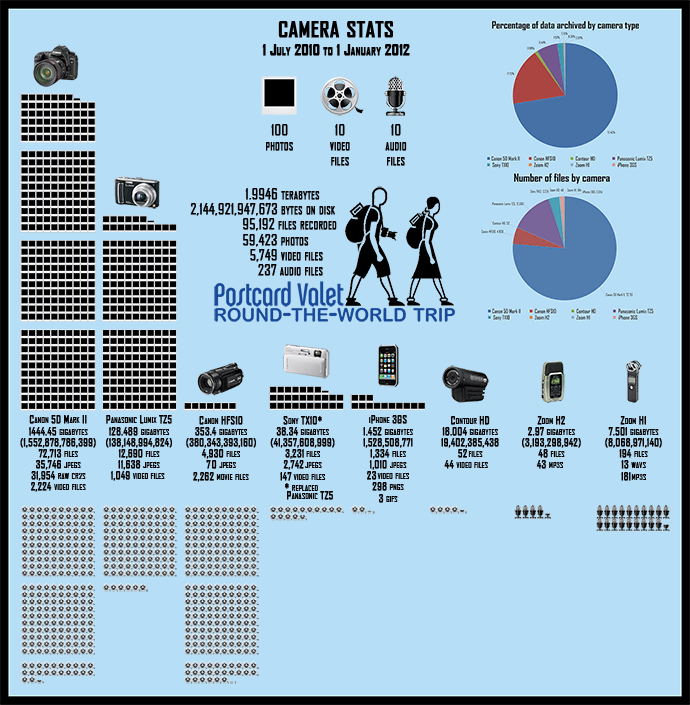
PV Infographic 2: Camera Stats

Infographic #2, Camera Stats

Our second infographic took longer than I thought to compile and layout, but if you take a look, you’ll see why.  9 different devices (2 iPhones, if  you were wondering), created over 95,000 files that were backed up to 3 different hard drives.  Almost 60,000 photos taken on this trip and more than 5,000 video files!  If I’m going to share this stuff with you all over the coming year — and that’s the plan — then I guess I have my work cut out for me!

Make sure to click on the image above to see a larger version.

January 7, 2012

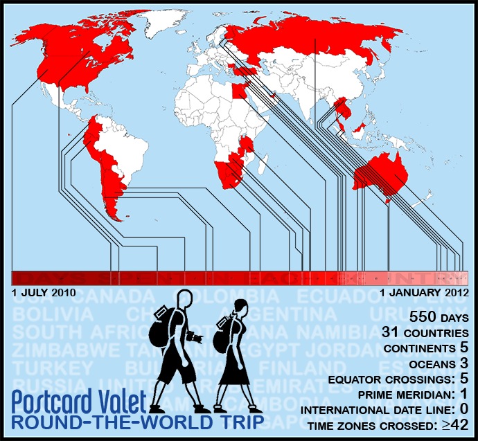
PV Infographic 1: Time and Place

Postcard Valet Infographic 01, time and place

Click to enlarge!

Throughout our round-the-world travels, Oksana and I managed to record a whole lot of data pertaining to our trip.  There were certain things we updated every single day (my journal, our travel budget, our GPS track) and some things that we recorded on a less frequent basis (number of buses, trains, planes, etc.)  While it almost became too much to keep up with at the end of a year and a half — I’m still catching up on our GPS page! — we saw it through and now have a huge amount of raw data to examine.  Personally, I find it fascinating to dig into this stuff and I can’t wait to see what it tells us!

  • What was our least expensive country?
  •  How many photos did we take?
  •  How many miles did we cover?
  •  How many hours did we spend on buses?
  • How much money did we spend?

On second thought, maybe I don’t want to know the answer to that last one…

In the coming weeks and months, as we parse this data for our own curiosity, I’ll be sharing it on our website.  But looking at spreadsheets and numbers probably isn’t fun for you, so I’m going to do my best to present it in a way that’s easier to digest.  I created this first infographic — which we tried to limit to simply time and place — with this in mind.  Hopefully it’ll be the first of many.

Make sure you see the full-size version!